The catalog that refused to die.
This company’s culture runs on a printed catalog — customers navigate by page, staff quote by page, decades of muscle memory live in those spreads. The migration’s answer wasn’t to retire that; it was to teach the modern store to speak catalog.
Every e-commerce platform ships the same product browser: a grid of cards, filters down the side. It works, and we have one. But when the executive driving our customer experience saw the first version of the digital catalog, his verdict was that a scrolling page of blocks was boring — he wanted the catalog. Pages. Spreads. Flipping. My first instinct was that this was nostalgia. My second, better instinct was that he was right: for customers who have ordered from page 15 for twenty years, the page is the interface, and throwing away that muscle memory to look modern is a trade only the developer wins.
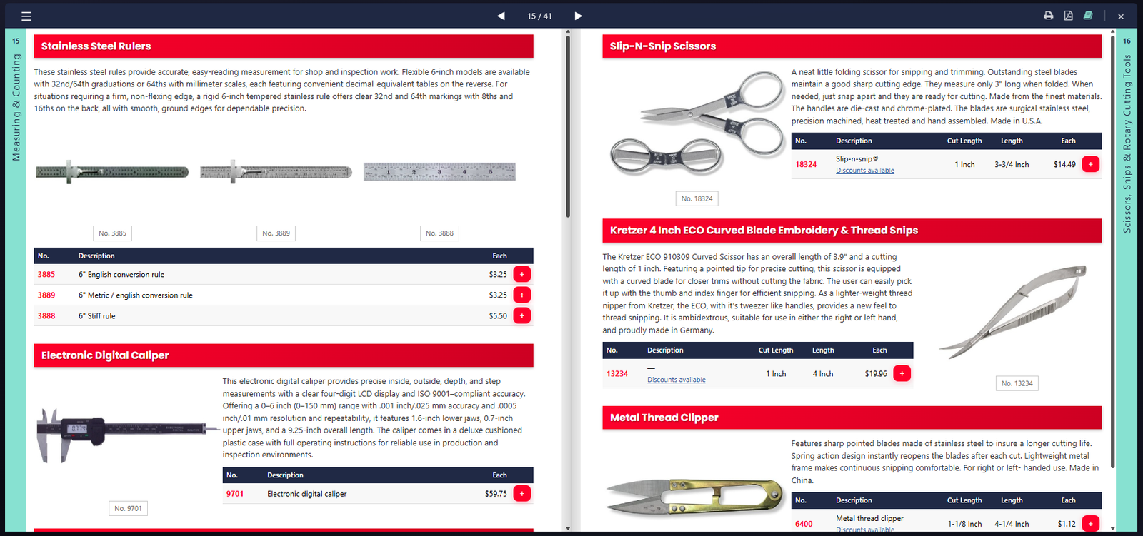
So the catalog became a real application: a React viewer living inside the storefront, rendering pages that staff curate from content blocks — section headers, product tables, feature spreads, intro text — managed in the platform’s backend like any other business data. No designer re-typesetting PDFs; the pages are assembled from the same product records that power everything else, which means every price on them flows through the pricing engine, every add-to-cart button is real, quantity discounts reveal themselves on items that actually have them, and the “previously purchased” badges from earlier entries show up here too.
The flip itself was the part most likely to be fake. Nearly every page-flip tool renders your pages as flat images and animates the pictures — which looks right and kills everything: no clickable prices, no cart buttons, no links. Ours flips live content: the page mid-turn is the same interactive markup as the page at rest. That choice cost real debugging — the flip engine’s drag handling kept eating button clicks, so pressing add-to-cart would turn the page instead — but it’s the difference between a brochure and a store. The viewer also prints and exports to PDF, because a customer who wants paper should get good paper.
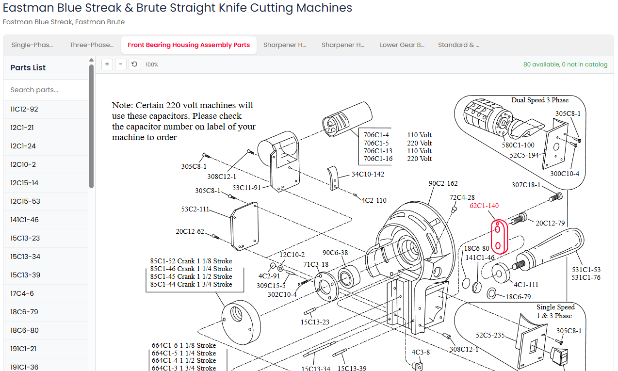
The catalog’s sibling might be my favorite feature in the whole build: interactive parts diagrams. This industry has always navigated repairs by exploded-view drawings — a machine dissolved into floating labeled pieces. In the viewer, those drawings are live: assemblies as tabs, a searchable parts list down the side, and every callout number clickable — select a part in the list and it lights up on the drawing; click it on the drawing and you’re looking at the real product, price and availability included. The header keeps an honest tally of how many parts on the drawing are actually orderable. A repair tech who has squinted at these drawings on paper for thirty years needs zero training; the drawing just answers back now. And the two viewers are integrated — diagrams live as blocks inside catalog pages, including in the PDF export, where each drawing is inlined whole.
Two closing notes for the regulars. First, this surface has already earned its keep in the log twice: it’s the page behind the 155-second fix from two recaps ago — a beloved surface is exactly the one that merits real engineering attention when it slows down — and the diagram viewer went through the same security-hardening audit everything else gets, because charming features don’t get a pass. Second, the thesis, since this series keeps circling it: migration isn’t modernization by deletion. The grid is there for people who think in grids. But forty years of customers think in pages — and now the pages think back.